


by Michal Korzonek: Overcome inertia and move ahead on your goals with these proven tools for visual thinking…
“By far the most significant learning experience in adulthood involves critical self-reflection — reassessing the way we have posed problems and reassessing our own orientation to perceiving, knowing, believing, feeling and acting.”
— Jack Mezirow
I was about to take over the navigational watch when the captain of our sailboat announced: The GPS is dead.
It wouldn’t have worried me so much — if the sea hadn’t be covered with the thickest fog I had ever seen in my life. With the visibility reduced to only a few meters and no GPS available, we were facing hours of blindfolded navigation, hoping to find an archipelago of islands so tiny that its name Ærtholmene comes from the Danish word ært, meaning “pea”.
Looking at the map didn’t bring me any comfort at all. I knew the coordinates of our destination, but without knowing the position of our yacht, I was unable to calculate a course which would bring us to land.
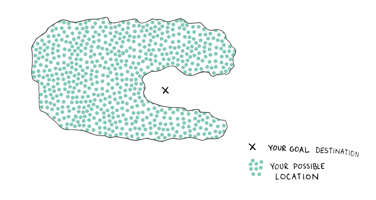
This made me realize a very simple, but crucial principle: if I don’t know where I am, then I can never reach the place where I want to be.
Even then, knowing where I am is not enough.
That foggy morning at sea helped me understand that in order to avoid disorientation in my life, I needed to have absolute clarity over three fundamental facts:
- My goals (the destination),
- My current situation (my coordinates), and
- The path that connects both of them (the route).
If you’ve ever experienced that feeling of being stuck, of going in circles without a clear sense of direction, or feeling that you had so many possible options to follow that you ended up not doing anything at all, you can probably relate. Deep down, you might feel that something is missing.
In order to find the right path, we need to become critically reflective of the situation. That’s what I did, using some simple diagrams, and I’m going show you how you can, too. These diagrams can help you:
- Map out the “territory” of your life and pinpoint your destination (your ideal life),
- Regain clarity at any moment and identify your current “coordinates”,
- Stay on the right course while managing your time and priorities.
Before we begin, here is how you can triple your ROI (return on investment) from reading this article.
According to the cone of learning model, reading is the least effective way of learning, with only 10% of information being retained. Using visuals triples that amount.
That’s why people generally enjoy infographics, and that’s why we’re going to use graphs to integrate the knowledge in this article.
However, you can take it even further by putting the graphics to practice and learning by doing (which brings the retention rate to a stunning 90%). To get the full benefit of this article, give yourself about an hour to create the diagrams yourself—either as you read it, or within 48 hours of reading it.
Why We Get Stuck in Life
How many people in your environment seem to have been stuck in the same situation for ages, unable to escape it’s tight-gripping claws?
Probably many. You might feel that way yourself.
Employment is a good example: the Gallup 2017 State of Worldwide Workforce Report revealed that only 15% of full-time employees worldwide are enthusiastic about their work. An alarmingly low number, this raises an important question: if so many people are unhappy with their workplace, why aren’t they making a change?
Around a year ago, I was facing this problem myself.
I had a job which paid quite well. I worked only 20 hours a week. The office had a nice and relaxed vibe to it, and my colleagues were very kind. The mission of the company was aligned with my personal values and I felt that I was making a positive impact in the world. Last, but not least, I felt that I was good at what I was doing, and my work had a positive impact on the company’s performance.
There was really nothing about my job to complain about.
And I didn’t.
However, every morning when I entered my office, I felt like a shadow of what I should be. I didn’t know what was wrong.
Whether it’s an unfulfilling job, toxic relationship, bad politics, poor health, lack of education, or something else, we all have had experiences when we felt we should have taken action to change the situation, but we never did. Why?
Welcome to the world of the status quo bias.
Making an alternative choice is hard because we are neurologically wired to favor the default solution, even if it brings suboptimal results. As the complexity of a decision increases, so does our tendency to stick with the answer we know.
What I needed for myself was a visual tool that could help me get to the core of what I truly wanted, and to help me understand why I didn’t feel fulfilled. Then, I would be better able to align my actions with my purpose.
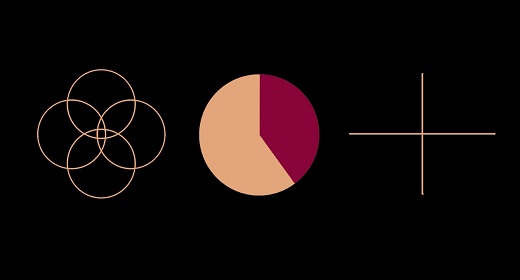
1. Ikigai Diagram

“The most joyful and intrinsic motivation human beings have for taking any action is the desire to meet our needs and the needs of others.” — Marshall Rosenberg
What is it for?
Finding your optimal direction and life’s purpose.
When to use it?
- When you feel lost or without a clear sense of direction
- When you feel that something is missing in your life
- When you do not feel happy with your current circumstances
- Before making a major decision about the direction of your life
What Is It?
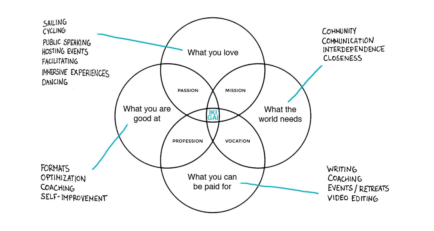
Ikigai is a Japanese concept, which combines ‘iki’ [生き], meaning life, and ‘gai’ [甲斐], meaning value or worth. It is usually translated as life’s purpose, and refers to living a happy everyday life. It also carries the idea of moving towards the future, reflecting your goals or ideal lifestyle.
If you would like to read more about ikigai, here are two resources to go deeper:
- Book: Ikigai: Giving every day meaning and joy
- Article: The Japanese Concept ‘Ikigai’ is a Formula for Happiness and Meaning
However, you only need a general understanding of the concept to make your own Ikigai diagram.
How the Graph Works
Ikigai provides an excellent visual framework to reach clarity and identify long-term life goal(s).
The concept of ikigai is often depicted as a Venn diagram, with ikigai placed at the center, where 4 sets (dimensions or foundations of life) overlap.
Ikigai encompasses:
1. What you love.
2. What you are good at.
3. What you can be paid for.
4. What the world needs.

Note: While in the Western World ikigai is commonly associated with employment, its original meaning does not imply this limitation. Ikigai can refer to work, but also to hobbies, relationships or simply enjoying the present moment. A person can also have more than one ikigai.
For the purposes of this article, we will identify ikigai as a combination of elements forming an ideal (and economically viable) lifestyle.
Time Required
Anything between 15 minutes up to 1 hour.
Results
- Gaining clarity
- Developing a sense of direction
- Verifying the viability of your destination
What’s the process?
1. Draw/print the diagram.
2. Identify at least 3 elements (such as activities, ideas, topics, values…) for each of the 4 foundations.
3. Divide the elements into 2 groups:
- Ends — vision & values
- Means — activities
Focus on the elements that resonate the most with you.

4. Examine your results. How could you combine the elements into your ideal lifestyle? How can the means give you a route to the ends? Are all the areas wel l cared for? Is there anything you might eliminate? Look for synergy (see below) and sketch out a vision of how they might come together:
5. Check for congruency. Can you visualize your ideal lifestyle? Does this vision resonate with you? Would your needs be fulfilled?
Keep rearranging the elements until you are satisfied with your result. You can try diagramming as many versions of a vision as you like until one resonates.
6. Reflect on your current situation and how it differs from your ikigai circle and the resulting vision you created. Which of your needs are not fulfilled? What is causing you stress? Which part of the ikigai diagram do you currently spend most of your time in?

7. Plan a transition — how could you move from your current situation towards the center of the diagram? Which areas require the most attention?

Hints and tips
In order to make the most of the ikigai framework, there are two concepts to keep in mind: balance and synergy.
Imagine the ikigai diagram as an elaborate balance scale with 4 weighing pans. Placing too much pressure on a single pan will disturb the equilibrium. In order to maintain balance, all 4 dimensions need to be equally cared for. In principle, this can be achieved by either aligning your activities to contribute to all 4 dimensions simultaneously, or redistributing your time to meet the needs of all 4 separately.
While looking at the activities in your diagram, try to identify not only how they can be included in your life, but, most importantly, how you can make use of apparently conflicting elements to harness potential synergies between them.
For example, I identified that while sailing might seem incompatible with coaching, organizing events and writing, there is no reason why I couldn’t engage in all of those activities while living on a sailboat. In fact, this sounded like the perfect lifestyle for me.
Drawing the ikigai diagram on my whiteboard for the first time was a profound experience.
I identified that I was spending most of my time in the area combining profession and vocation, but I wasn’t really doing what I love.
This realization prompted me to start seeking an alternative path. I continued to use the graph as a framework to test viability of my ideas. I wanted to make sure that my new path would not only resonate with me, but also be economically viable. I didn’t want to simply quit to fulfill my dreams, only to come back to another job I disliked after my savings ran out.
A few months later, I quit my job. Once I had a very clear vision, my status quo bias was not holding me back anymore. And now, over a year later, I am still thriving.
2. The Piechart of Time
“Life, if you know how to use it, is long” — Seneca
I remember the day I quit my job very well.
The weather was amazing, and instead of cycling I decided to take a long walk home. I felt confident and excited, and I was singing on my way. Some people were staring, but I didn’t care. I felt free.
Later on that day, it finally hit me: from that day on, all the time would be my time.
After a moment of euphoria and gratitude I began to feel overwhelmed. Possibilities seemed endless. I wanted to travel, tour on my bicycle, sail across the Atlantic, visit Nepal, build a community, participate in exciting projects, improve my juggling skills, build fulfilling relationships, learn new skills, read books… the list was infinite.
The freedom to do anything with my time felt scary. I was fully responsible for making anything happen, and there was nobody to hold me accountable.
Where should I start when there were so many possible ways forward?
I thought about my ikigai diagram. Even if I had a clear and viable direction, I needed to translate it into a tangible and actionable plan. I had to “schedule” my ideal lifestyle.
That’s when I started to think about time from a different angle.
There are 8766 hours available per average calendar year. After subtracting 9 hours per day for sleep and other physiological needs, it leaves around 5479 hours at our disposal. That translates to 328,740 minutes (and you have invested 10 of them into reading this article so far).
5479 hours is a lot of time; however, it is not unlimited. In fact, with every passing minute, the total amount available to us is decreasing at a steady and irreversible pace.
If you would have only 1 year left to live, how would you spend your time? What if you only had 7 days?
I guess that you wouldn’t waste much of it. I know I wouldn’t. Instead, I would treasure every minute and try to make the most out of it. I would prioritize the most important things, and forget about the trivial.

If our time is both limited and increasingly valuable, then it seems reasonable to reflect on how we want to spend it.
Later on that day, I grabbed a pen and drew a circle on my journal, and called it “The Pie Chart of Time”.

What is it for?
Identifying the most optimal ways to spend your time.
When to use it?
- When you feel that you don’t have enough time to do what you want/should/need to be doing
- When you don’t know which activities to choose
- When you are undergoing a major life change (eg. graduation, starting/quitting a job, starting/finishing a relationship…)
- When you are brainstorming your ideal lifestyle
- When you want to analyze how you spend your time
What is it?
The Pie Chart of Time is a visual tool I have developed for long-term time management.
How the graph works
The time available within the pie chart is limited (unlike in calendars, in which any activity can simply be moved to a different day). Because it reinforces the idea of scarcity, you are forced to prioritize.
The pie chart represents the total amount of time available within a chosen period of time. I found that one year is my personal preference, but the tool will work for any other duration.
The embedded slice represents the time necessary to sleep, eat and take care of physiological needs. I’ve rounded it up to 40% (based on 8 hours of sleep + 1 hour for other needs = 37.5%). It’s a kind of “physiological tax” you have to pay to your body everyday for being alive.
The remaining 60% represents the time available to you. Let’s work through how to create your own.
Time required
Anything between 15 minutes to 1 hour.
Results
- Gaining clarity over your desired/current time distribution
- Effective prioritization
I have drawn around 4 pie charts until I was fully satisfied with my plan. Then, I set the final result to be my desktop wallpaper. Once I knew how I want to be spending my time, it was easy to start scheduling.

What’s the process?
(Although it is not required, completing the Ikigai Diagram, above, prior to the Pie Chart of Time, provides an excellent starting point.)
1. Identify a time period that feels right for you. One year is a good point of reference for long-term planning, but the pie chart can be used on a weekly or monthly basis as well.
2. Identify activities which you would like to engage in within that time period.
3. Draw/print the pie chart as a simple circle. Add a section of the pie for the physiological tax.
4. Divide the remaining time within the pie chart between activities. Start with your ideals, and adjust as you go. Think about how you spend your hours, days, and weeks, and how this relates to the time period represented by the whole “pie”.
By using this tool, you will have no chance but to prioritize. How can you use your time more efficiently? Is there anything you could remove to free up more time? What are the biggest time-wasters? What activities are non-negotiable and need to be included in the chart?

5. When your “ideal time distribution pie chart” is completed, repeat steps 2–4 to create a pie chart representing the things you are actually doing right now in your life. (Use the same period of time for both pie charts.) Estimate the time you currently spend on those activities, or others.

6. Compare the pie charts. How could you move towards your desired time distribution? What are the time wasters? Which activities can you drop or reduce? How could you free up more time? What needs to change?
Hints and Tips
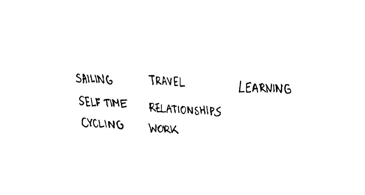
Experiment with being broad and then go more specific, so that you can find what feels more intuitive. I tend to use a combination of both: some activities are “categories” (eg. relationships, self-time, work) and some are very specific (sailing and cycling).
3. The Time Management Matrix
My new adventure began with a sailing journey.
The sea helped clear my mind, and I was ready to implement the lessons from the previous months. I reviewed my ikigai diagram and the pie chart of time and set myself to work. My goal: building a sustainable, fulfilling, location-independent lifestyle.
I started my own business, ensuring that it allowed me to be in the center of the ikigai graph. I planned my time to reflect the pie chart, so I would have enough time for myself, my relationships and my work. I planned another sailing trip for later that year.
However, as the months passed by, I realized that my progress was slower than I had expected.
My business was not earning enough to provide me with financial stability, and to speed up the process, I was gradually devoting more and more time to it. That made me sacrifice time for relationships and myself. On one hand, it didn’t feel like a sacrifice at all, since I absolutely loved what I was doing. On the other hand, I was becoming more tired and I subconsciously knew that I was heading straight for a crash.
One day, I decided to draw a new pie chart of my current time distribution and I realized straight away that I was very far from where I wanted to be. It seemed like my work had absolutely dominated all the chart and was soon going to start eating the slice reserved for my physiology.
Everything demanded my attention, and since I was short on money, I couldn’t outsource the work that I didn’t want to do myself. My days consisted of developing the overall strategy, producing content, communication, and fighting fires wherever they appeared, while simultaneously learning all the aspects of running a business. Aside from working within my fields of expertise, I was now also responsible for administration, legal, accounting, marketing, cybersecurity and web. My brain was about to blow up.
Reading “The 7 Habits of Highly Effective People” by Stephen Covey brought me a significant dose of clarity.
It made me realize that I had been working against the “P/PC Principle”, which instructs that achieving effectiveness requires balance between production and production capability. In other words, in order to produce, we need to take care of ourselves.
And in order to have the time to take care of ourselves, we need to learn how to work smart.
That’s when I started using the matrix of time management.

“He who cannot change the very fabric of his thought will never be able to change reality, and will never, therefore, make any progress.” – Anwar Sadat
What is it for?
Conquering your busy schedule, once and for all.
When to use it?
- Constantly dealing with crises
- Problems with prioritization
- Struggling to manage daily tasks
- Approaching a burnout
What is it?
The Time Management Matrix — originally developed by Dwight Eisenhower and later popularized by Stephen Covey — is a visual tool for time management, and evaluating tasks to decide whether they should be carried out, delegated or dropped.
How the graph works
The time management matrix divides tasks into 4 quadrants:
1. Urgent and important (“crises” or “fires”).
2. Not urgent and important.
3. Urgent and not important.
4. Not urgent and not important.
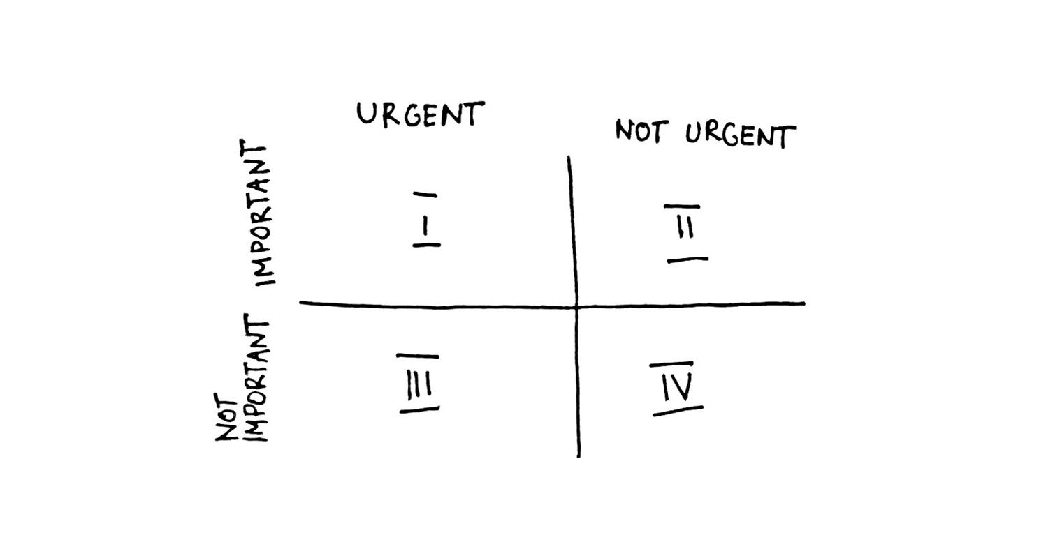
Spending too much time in quadrant 1 leads to stress, burnout and crisis management, which gradually tends to consume all the time available.
Quadrant 3 is often mistaken for quadrant 1 (since the tasks at hand are urgent, eg. a ringing phone), but in reality the urgency is based on priorities of other people. Spending too much time in quadrant 3 leads to gradual loss of control and long-term vision.
Spending time mostly in quadrants 3 and 4 is pretty much the worst case scenario, with no sense of responsibility or control.
The aim is to spend as much time as possible in quadrant 2, which is at the core of the effective personal management. While the activities are not urgent, they are important: developing relationships, long-term planning, exercise, maintenance — or as Steven Covey puts it, “all those things we know we need to do, but somehow seldom get around to doing, because they aren’t urgent.”
Time required
Approximately 20 minutes.
Results
- Effective time management and prioritization
- Preventing problems before they happen
- Maintaining the P/PC balance
What’s the process?
1. Draw / print the blank matrix
2. Identify tasks you engage with and distribute them into appropriate quadrants

3. Reflect on which quadrants you spend the most time in.
4. Reflect on what preventive measures and processes you can put into place to reduce the amount of quadrant 1 activities.
5. Develop a plan to transition more of your time into quadrant 2. Could you outsource/delegate any tasks that are in quadrant 1?

Hints and tips
Ask yourself — What is the most important thing I need to start doing in my personal/professional life that would have the greatest impact? How could you include it in your matrix?
Incorporating the time management matrix into my weekly planning sessions changed the way how I live and how I work.
I identified time wasting activities and refused to act on urgency if the task carried no importance. I changed the allocation of resources (and time), increasing the amount dedicated to activities within quadrant 2. Consequently, I was preventing problems, which would otherwise keep me busy firefighting. I included a non-negotiable time off in my weekly schedule, as well as time for critical reflection.
I also discussed the time management matrix with my partner and we applied it together to our relationship. We are now spending much more time in quadrant 2, actively working on listening, supporting each other, and expressing love and gratitude.
A few weeks after I first implemented the time management matrix into my life, I drew another pie chart of time. This time, the results brought a big smile to my face. The mist was clearing up and I was unmistakably moving towards where I had set myself to be.
Use the 3 Diagrams Together For an Extraordinary Sense of Direction
“Real, serious, lifelong fulfillment and meaning have to be earned through the choosing and managing of our struggles.” — Mark Manson
These three graphs will not solve all your problems. However, you can use them to create a comprehensive map, guiding you through choosing the problems you want to face and leading you towards living a fulfilling life.
The Disappointment Panda, a superhero invented by Mark Manson in his book “The Subtle Art of Not Giving a F*ck”, shares a piece of timeless wisdom: “Don’t hope for a life without problems (..) There’s no such thing. Instead, hope for a life full of good problems.”
Choosing the good problems is something these diagrams can can help you with:
- The ikigai diagram is a framework for a long-term goal setting, with the goal being your ideal lifestyle.
- The pie chart of time translates your ideal lifestyle (visualized with the ikigai diagram) into a practical distribution of your time. It can also be used to reflect on your use of time and assess your progress.
- The time management matrix shifts your mentality to be more proactive, and reallocates your energy into preventing problems rather than fighting fires. It helps you focus on what is important, while eliminating time wasting activities.
It’s been over a year since I changed my lifestyle, and even if it’s not an easy process, I have never looked back.
Just like trying to find a tiny archipelago (your goals) within the vastness of the sea (possibilities), living your ideal lifestyle requires supreme navigational skills, as well as effective tools and processes to support you in your journey. The road ahead will still be full of problems to solve, but now you have some tools for helping you find the route.